The bitter something
The success story of Schweppes began more than 200 years ago in Switzerland. In 1972, Reinhart Morscher broke new ground with his advertising graphics for this exclusive British beverage. The graphic artist born on 11 February 1938 would have turned 80 yesterday.

Felix Graf
Felix Graf was a curator at the National Museum Zurich until 2017. Now he works as a freelance publicist.
Schweppes! – We’ve all heard of it, this bitter something. But who would associate this exclusive refreshing drink from England with Switzerland? In actual fact, the history of the world’s oldest soft drink, which dates back more than 220 years, began in Geneva. Around 1780, Johann Jakob Schweppe, a jeweller from Geneva of German origin, began experimenting with adding carbonic acid to water. In 1790, together with the Geneva pharmacist Henri-Albert Gosse, he founded a soda water factory. A brochure from the same year touts artificial mineral water as a table beverage for the first time. During the turmoil of revolution, Schweppe emigrated to London and established a new company in 1792. English industrialists continued to develop the soda water and in 1897 gave it the name Schweppes.
A brief history of Schweppes. Video: Schweppes / YouTube
English and exclusive
“Schweppes is a product of distinguished class for discerning people” – this global brand has also been produced in Switzerland since the early 1970s. Christian Jaquet, who was then co-owner of the Bernese advertising agency Hablützel & Jaquet, explains how this came about: “Jack Gauer, patron of the Bernese luxury Schweizerhof hotel, is said to have come across its bitter taste in a gin and tonic in London after the end of the war. The discovery of Schweppes made him so happy that he began to import this tonic water in little crates. As demand soared for this exclusive English beverage, a friend of Gauer, the owner of the Weissenburg mineral spring in the Simmental valley, set about successfully producing Schweppes in Switzerland.” In 1972, Hablützel & Jaquet launched an advertising campaign for Schweppes in Switzerland. In charge of graphics at the studio was Reinhart Morscher from Bludenz in Vorarlberg who now lived in his adopted home cities of Basel and Berne.
“Experimental graphics”
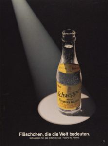
Morscher triumphed with his first Schweppes poster. He experimented with black and red crayons on Schweppes labels, concealed lettering and reassembled sequences of letters and words from label fragments, thereby creating a graphical language which communicated through concealment, concentration of colour and empty space. Right from the very first glance, the idiosyncratic realisation of the brand image simply and impressively satisfied the mandate – “unique to the trademark, adult and stylish” – as well as the brand’s motto and claim. The jury of the Federal Department of Home Affairs also decorated the poster as one of the best Swiss posters of the year 1973.
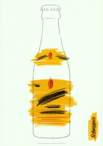
Reinhart Morscher. Consumer poster for Schweppes. Offset printing. 1972. Photo: Swiss National Museum
“Little bottles which mean the world”
A series of sketches for photographic magazine adverts are particularly interesting. The sketches drawn in felt-tip pen, which was still a novelty back then, reveal Morscher to be a master at combining word and image. It is no coincidence that he taught not only visual communication, but also verbal communication, at the Basel School of Design from 1984 to 1998. In addition, his good relationship with Martin Suter and contact with Beat Keusch, both initially at the advertising agency GGK in Basel, then at Stalder & Suter, as well as a shared interest in the experimental poetry of Ernst Jandl and the writings of Dieter Roth, were the perfect complement.
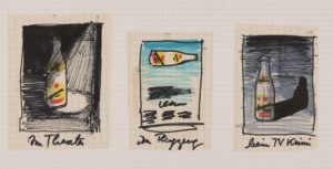
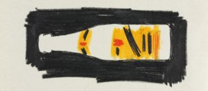
Reinhart Morscher. 3 sketches for Schweppes advertisements. Around 1973. Felt-tip pen on squared A4 sheet. Photo: Swiss National Museum
Proof for full-page Schweppes advertisement. Around 1973. Photo: Swiss National Museum
“Master of open space”
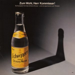
Reinhart Morscher, who attended the school of design in Basel and studied art history and philosophy at university for a few semesters, had already been described as a “master of open space in communication”. This characterisation is very apt and especially appropriate for his advertisement for Schweppes. He makes his statement with concealment and empty spaces in a familiar context. His idiosyncratic approach – Reinhart Morscher himself calls it “intervention” – is rooted in his own life experience; during his youth in Bludenz, he received letters from his father in captivity during the war. Sections of the letters had been removed by censors. A particularly fine example of his “intervention” approach is provided by the poster for the exhibition Text and Image on the Roadside at the Gutenberg Pavilion in Mainz and the final drawing for a newspaper advertisement for Schweppes with the motif of sparkling water. Punch-outs created from the label rise like bubbles to the top of the advert. The advertising text reads as follows: “Schweppes – dépille depuis 1792” (Schweppes – causing a stir since 1972).

Reinhart Morscher in Basel, 2004. Image: Armin Vogt. Privately owned
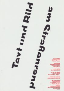
Reinhart Morscher. Poster. Text and Image on the Roadside, posters. Gutenberg Pavilion exhibition in Mainz. 2000. Offset printing. Photo: Swiss National Museum