How should a map be illuminated? Not everyone saw it in the same light. Illustration by Marco Heer

Casting light on relief map shading

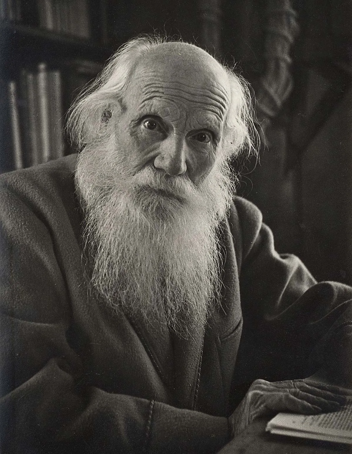
In 1927, geologist Albert Heim clashed with cartographers at the Federal Office of Topography as he was convinced that their relief maps of Switzerland were depicted in the wrong light. Heim believed that the light source on maps should correspond to natural sunshine.

Felix Frey

Felix Frey

Felix Frey is an expert in history at the Federal Office of Topography (swisstopo).

Albert Heim (1849–1937) was a real high achiever. In 1873, at the tender age of 24, he was appointed professor of geology at the Zürcher Polytechnikum (now ETH Zurich) and three years later, he also held the same position at the University of Zurich. Through his research into the formation of the Alps, the geology professor made a name for himself well beyond Switzerland’s borders. But Heim’s activities were not limited to geology. Whenever an issue was close to his heart, he would argue his case with great tenacity. For example, Heim was a fervent advocate of cremation, which in the 19th century was still far from conventional – Switzerland’s first crematorium at the Friedhof Sihlfeld in Zurich did not open until 1889. The geologist also championed equal rights for women and was involved in the temperance movement, which called for abstinence from alcohol.
Albert Heim, photographed in 1934.
Albert Heim, photographed in 1934. e-pics
Heim’s passionate interventions in the world of Swiss cartography are less well-known. In 1927, the then 78-year-old geologist denounced Switzerland’s two official map series – the Dufour Map and the Siegfried Map – as he believed they contained a “lie” that “flew in the face of nature”. The bone of contention was the fact that the imaginary light source that created light and shade on relief maps, therefore lending them a three-dimensional effect, came from the northwest in both map series.
The Siegfried Map (here sheet 473, Gemmi), which was in circulation along with the Dufour Map at the same time as Heim’s paper, also showed south-facing slopes in the shade and north-facing ones in the light.
The Siegfried Map (here sheet 473, Gemmi), which was in circulation along with the Dufour Map at the same time as Heim’s paper, also showed south-facing slopes in the shade and north-facing ones in the light. swisstopo
Albert Heim was an avowed opponent of the ‘northwest illumination’ of maps, which had become increasingly established throughout the world in the 19th and 20th centuries. The geologist believed that it contradicted reality as in Switzerland the sun usually shines from the south.

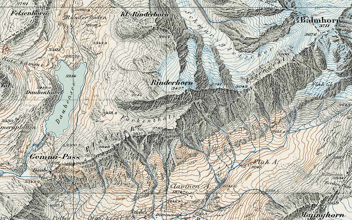
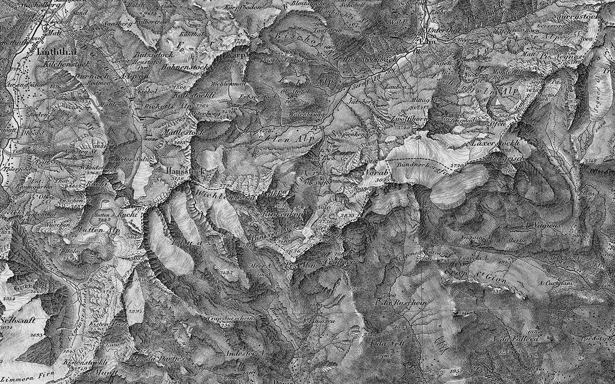
It pains me to see the warm vineyards and villages on the sunny side of the main Valais valley on the north side of Lake Geneva and the heavily-farmed sunny slopes of the north side of the Anterior Rhine Valley in the shade, while the wooded slopes on the shady side are bathed in blazing sunlight.

Albert Heim, geologist
Albert Heim therefore saw northwest illumination as a “mistake of the past” that needed to be corrected. He believed that maps should reflect the natural conditions and called on the producer of official maps of Switzerland, the Federal Office of Topography (now swisstopo), to transition to southern illumination and take “the major step from mistaken convention to nature”. Heim was not alone in his view – Emil Klöti (1877–1963), a member of the Council of States from Zurich – delivered impassioned calls to Swiss topographers in favour of southern illumination in the 1930s.
Map-Glarus-northwest-lighting
Map-Glarus-southern-lighting
Comparison slider left: The Dufour Map showed the Glarus Alps illuminated from the northwest, while the south-facing slopes are in the shade. On the right: The Karte des Kantons Glarus of 1860 illuminated the Glarus Alps from the south. swisstopo / swisstopo

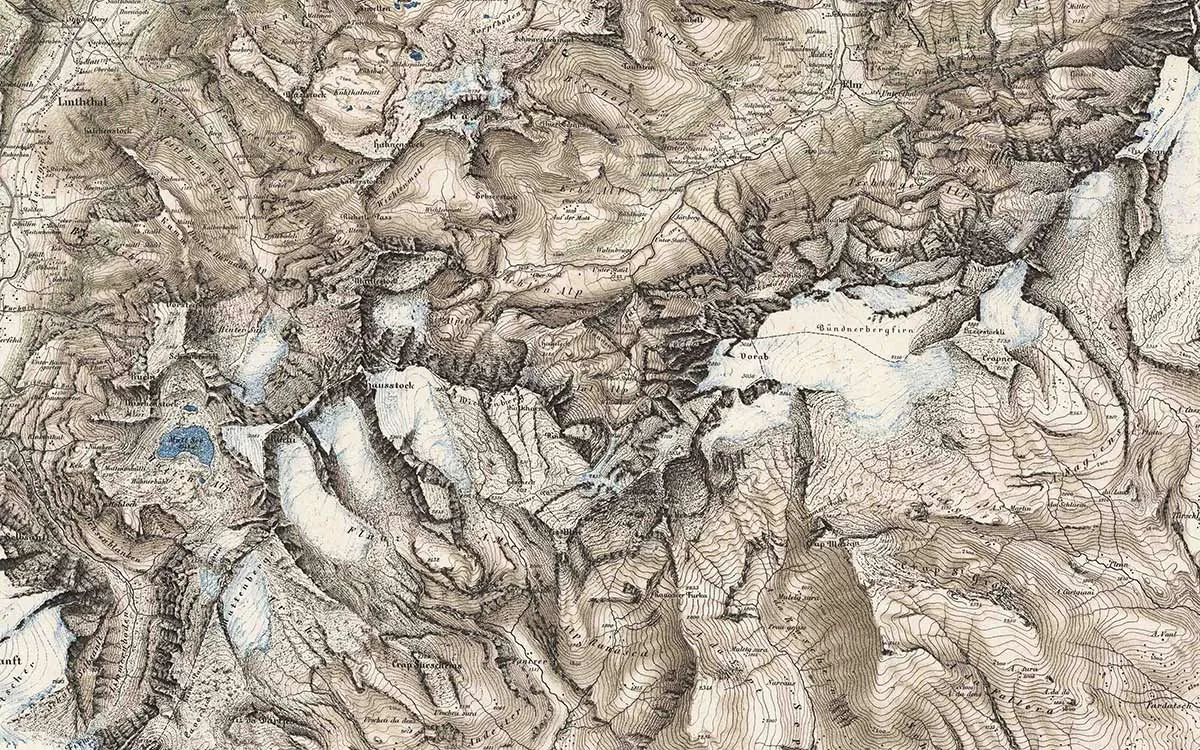
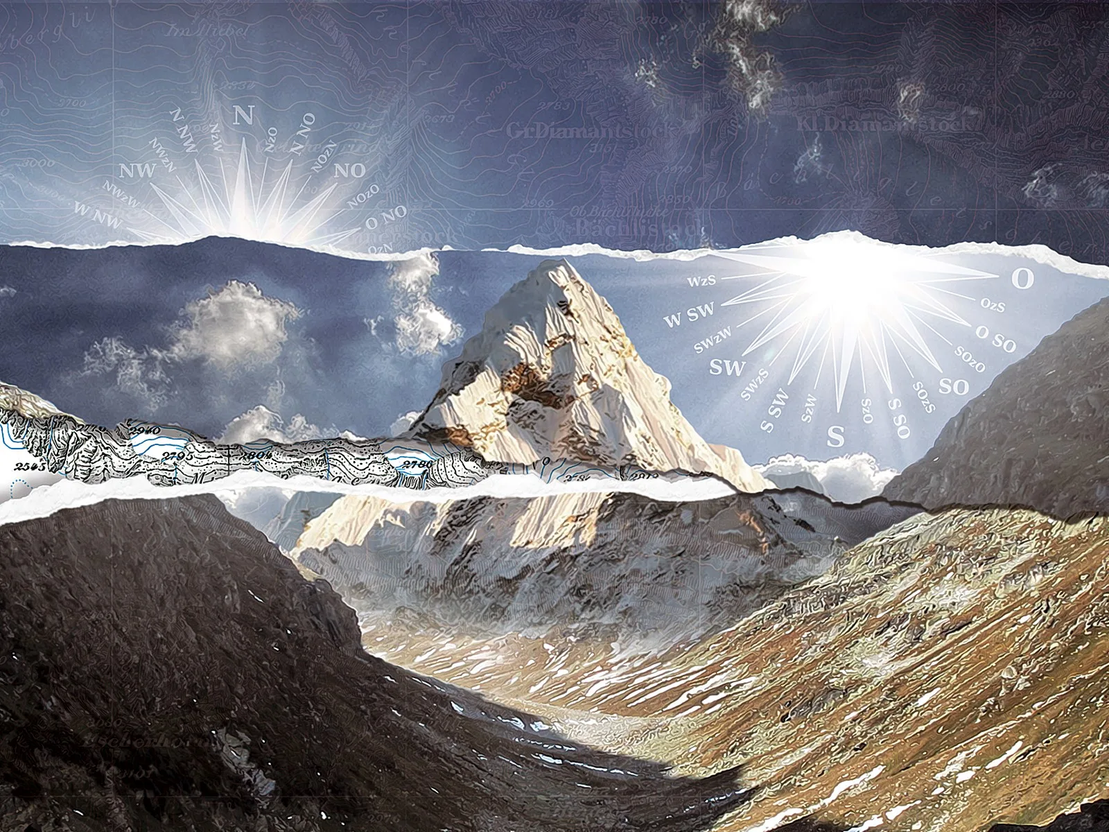
Why are most maps illuminated from the northwest?

Today, the north-west illumination of maps is a matter of course for the human eye. The introduction of south illumination would lead to misinterpretations: Valley floors would be mistaken for mountain ridges and mountain ridges would be misinterpreted as valley floors. However, this visual habit is not natural, but learnt. So why did north-west illumination become the dominant norm in map design? Two explanations that were put forward during the illumination debate in the late 1920s are worth mentioning here. The first, and the one to which Albert Heim himself subscribed, was the working method of the illustrators and engravers who produced the maps. According to this argument, the cartographer drawing with his right hand needs the light source to come from the top left so that his drawing hand doesn’t cast a shadow over his work. However, as illustrators and engravers would frequently rotate their sheets or copper plates back and forth while working, this presumption is not entirely convincing. The second, emphasised by Zurich professor of cartography Eduard Imhof (1895–1986) in his response to Heim’s polemic paper of 1929, states that illumination from the left was due to the fact that people in Europe write from left to right and that the majority of people draw with their right hand. This is why, he argued, even in Medieval and Early Modern maps, the light falls from left to right. It initially had nothing to do with the orientation of real sunshine: in maps produced in the Medieval and Early Modern periods, east was often on the left and south at the top; there was no standardised approach. Only when the north orientation became established as standard on maps in the 19th century did top left illumination evolve to become illumination from the northwest.
Not only writing from left to right, but also lighting: the mountains of the Chur Rhine Valley and the Anterior Rhine Valley are in the light on the left and in the shade on the right on the map of Switzerland produced by Aegidius Tschudi in 1560. On this map, east is on the left and south at the top.
Not only writing from left to right, but also lighting: the mountains of the Chur Rhine Valley and the Anterior Rhine Valley are in the light on the left and in the shade on the right on the map of Switzerland produced by Aegidius Tschudi in 1560. On this map, east is on the left and south at the top. Wikimedia / Zentralbibliothek Zürich
Ultimately, the row over the direction of illumination was based on differing ideas of what a map is for. Albert Heim believed that a relief map should reflect the conditions in nature ‒ and therefore also how the light hits the terrain ‒ as realistically as possible. Meanwhile, cartographers at the Federal Office of Topography wanted their maps to be a tool that allowed the most unambiguous and intuitive spatial orientation possible. They saw the light on the map as a stylistic means to allow elevations and dips to be identified more quickly, and this had nothing to do with real sunlight. Despite his persistence, Albert Heim was banging his head against a brick wall on the illumination question – even today, nearly all maps everywhere are illuminated from the northwest. In the end, his arguments didn’t stand a chance against visual habits that had become established over centuries. Continuity is an important currency in cartography; a change in the already established north-westerly direction of illumination would have caused too much confusion even almost a 100 years ago.

Space and time

This article was originally published (in German and French) on the “Space and time” website of the Federal Office of Topography (swisstopo), where readers can regularly discover thrilling chapters from the history of Swiss cartography.

Further posts