Crossing linguistic borders: Roman Scherer’s typefaces conquered the world in the early 20th century.
Crossing linguistic borders: Roman Scherer’s typefaces conquered the world in the early 20th century. Letterform Archive

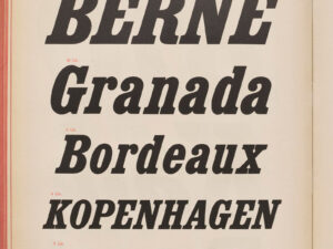
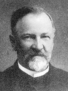
World-famous typefaces from Kriens

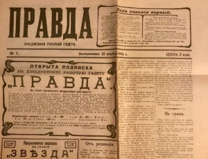
Roman Scherer’s highly specialised factory in Kriens manufactured wood type for the whole world – including for Pravda, the official newspaper of Russia’s Communist party in Moscow.

Michael van Orsouw

Michael van Orsouw

Michael van Orsouw has a PhD in history and is a performance poet and author. He regularly publishes historical books.

Kriens is an industrial town close to Lucerne. Nestled between the Sonnenberg and Mount Pilatus, Kriens is intercepted by the Krienbach river, which brought trade and industry to the town early on. Roman Scherer moved there around 1890 as he needed more space for his business. The Kupferhammer district was the ideal location because it was a neighbourhood accustomed to the sound of hammers and saws and had direct rail connections.
The marshalling yard in Kupferhammer, Kriens: the Scherer wood type factory was located just behind it. Photo circa 1920.
The marshalling yard in Kupferhammer, Kriens: the Scherer wood type factory was located just behind it. Photo circa 1920. Ortsarchiv Kriens, Museum Bellpark
Roman Scherer was a farmer’s son from Meggen in the canton of Lucerne. He was born in 1848 and attended the cantonal school. But he wasn’t cut out for academic study. After leaving school, Scherer initially completed a commercial apprenticeship at the Stahlwerk von Moos steel works in Emmenbrücke. He then worked at banks in Ticino and France.
Typographic pioneer Roman Scherer.
Typographic pioneer Roman Scherer. portraitarchiv.ch
On his return to Lucerne, Scherer first worked at a bank, and at an early age took over the management of the Pays’schen Fabrik factory that produced wooden furniture and rifle stocks in Lucerne. In 1877, the 29-year-old set up his own business, acquiring the machines and equipment from a company that had gone bankrupt in the Valais. Scherer manufactured letters for letterpress printing using wood from local fruit trees, which were in abundant supply in the Lucerne region. The letters were used in printing processes for posters, headlines and titles.
An insight into the production processes at a wood type factory: in 1913 the letters were made by hand.
An insight into the production processes at a wood type factory: in 1913 the letters were made by hand. Ortsarchiv Kriens, Museum Bellpark
Business was booming, in part because Roman Scherer had targeted an international customer base from an early stage. This is why he moved to Kriens around 1890 to set up a proper factory and employed a workforce of up to 100. Manufacturing this sort of wood type for printers was a highly specialised niche business. Only manufacturing for the local region or for the Swiss market would never have paid off. Roman Scherer’s wood type factory therefore focused heavily on expansion and found customers throughout Switzerland, but also in France, Spain, Italy, the Balkans, Russia, Japan and China. By around 1900, the factory in Kriens was already producing 50,000 letters a year.
Roman Scherer’s ‘Reform’ soon became the title font of the Russian daily Pravda.
Roman Scherer’s ‘Reform’ soon became the title font of the Russian daily Pravda. Photo: Philipp Messner
In order to sell to customers in Russia, Scherer produced special Cyrillic typefaces – with great success. For example, the design of the typeface used by the Russian daily, Pravda – the key publication of the Russian Communist party – harked back to a wood type made by Roman Scherer. His type series ‘Serie 5015’, known as ‘Reform’ formed the basis of the typeface for the flag on Pravda. So, in this way, the wood type factory in Kriens played a small part in Russia’s Communist movement, or Communist truth, as that is what the word ‘Pravda’ means. Having said that, Scherer had developed this typeface as early as 1905, while the Pravda newspaper only became one of the highest-circulation newspapers in the Communist world from 1912.
The first issue of the newspaper Pravda from May 1912.
The first issue of the newspaper Pravda from May 1912. Wikimedia
The pinnacle of the industrial career of Roman Scherer – known as the ‘king of type’ – was at the International Exhibition of the Book Trade and Graphic Design in Leipzig in 1914, where he was presented with the gold award. Scherer’s factory then expanded its range to include poster types made from cast aluminium. Eight years after receiving the award in Leipzig, Scherer died at the age of 74, but his company continued to exist until 1966.
Death notice in the newspaper Der Bund dated 21 February 1922.
Death notice in the newspaper Der Bund dated 21 February 1922. e-newspaperarchives
Roman Scherer’s type books are still sought after by designers as the Kriens-based firm’s typographical design was very clean but also very fanciful. Basel-based historian Philipp Messner, who produced an excellent piece of research into Scherer’s work, tracked down Scherer’s type books at the Basler Papiermühle museum of paper and printing and at the Lucerne Central and University Library. Scherer’s typefaces have also found their way into the famous type design collection compiled and maintained by Luc Devroye at McGill University in Montreal. And in 1972, a reprint of Scherer’s art nouveau and art deco typefaces was published in the United States. His work is also documented in the Letterform Archive in San Francisco. So it’s probably safe to say that the typefaces from Kriens are now much more famous than their birthplace.
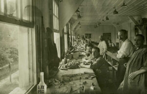
Film by the Letterform Archive in San Francisco on a catalogue from 1920. It provides a good insight into Roman Scherer’s wide range of different typefaces. Letterform Archive

Further posts