A little piece of Switzerland in your wallet
Switzerland’s banknotes were given a makeover in the 1990s. The eighth series (1995–2016) not only met strict security requirements, it was also innovative in its design. A voyage of discovery through the archives and a look behind the scenes reveal how these banknotes were planned, designed and introduced to the public.

Eric Häusler und Jürgen Häusler
Eric Häusler is a historian at ETH Zurich. Jürgen Häusler is Professor Emeritus of Communication at the University of Leipzig and was a long-standing member of the executive board of Zintzmeyer & Lux AG.

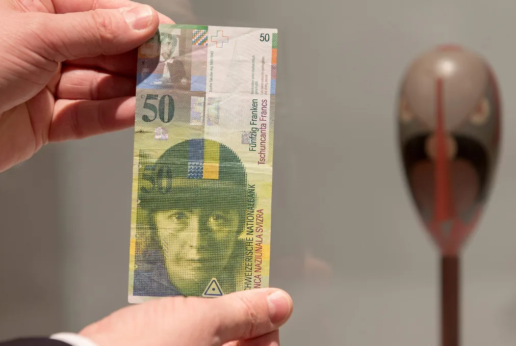
The banknotes in the eighth series were released in phases from October 1995, starting with the ‘Green Sophie’. This was the first banknote issued in Switzerland to feature a woman. Swiss National Bank Archives, BN359.602 / Keystone, photo: Friso Gentsch
Colour copiers
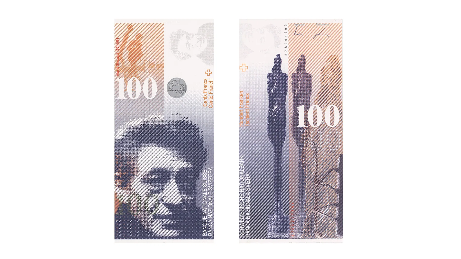
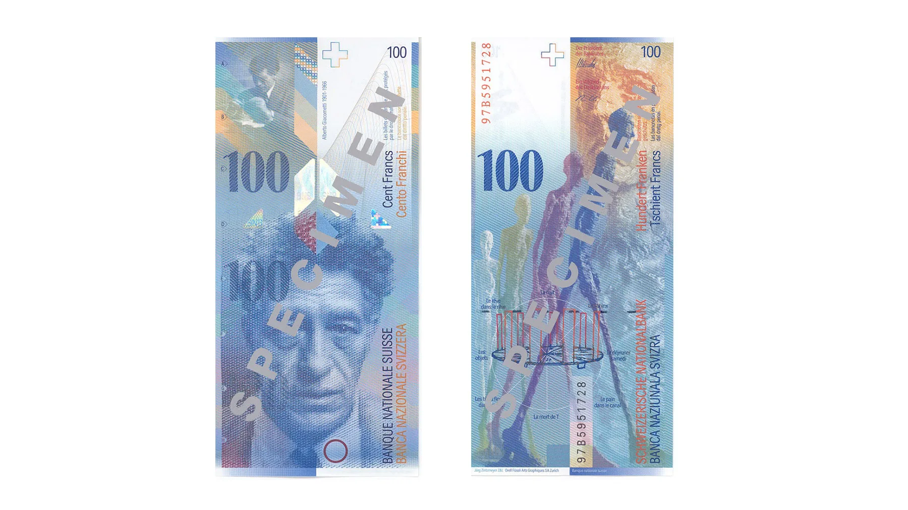
The personalities
As was only to be expected, this decision met with detractors. Critical voices saw it as a belated and to some extent unjustified attempt to ‘appropriate’ or reclaim exiled artists who had gained international recognition while living outside Switzerland. But the very fact that several of these figures had spent many years living and working abroad or gained recognition there was part of the concept. The banknotes were never meant to uphold the country’s established self-image. They were supposed to get people thinking about history, culture and the question of how to convey national identity.
The designer
Part of the new approach involved setting up a specially secured working environment. This screened off space with strictly controlled access was referred to in-house as the ‘bunker’. Creative work was performed under the strictest official secrecy at two successive addresses in Zurich. The Swiss National Bank shelled out a good half a million francs for the structural measures, office furniture, safe, computers, software and technical infrastructure needed to set up this facility.
In this high-security area, the banknotes were designed for the first time ever using a purely digital process. From the initial sketches and colours right through to the fine lines and security features, everything was created, checked, refined and documented using computers. The eighth banknote series thus marked a watershed in terms of design and use of media: the point at which banknote origination crossed over into a fully digital, institutionalised era.
Teamwork
Security above all
The novel security features and unusual design concept of the new series called for a targeted communication strategy. Therefore, the Swiss National Bank decided to go on the front foot with its information campaign. Brochures with titles such as ‘The new banknotes. Easy to check’ were produced along with pamphlets, flyers and information material for banks and the general public. The aim was not to impart painstaking technical details about the new banknotes, but to help people understand how easily these items of everyday use could be verified.
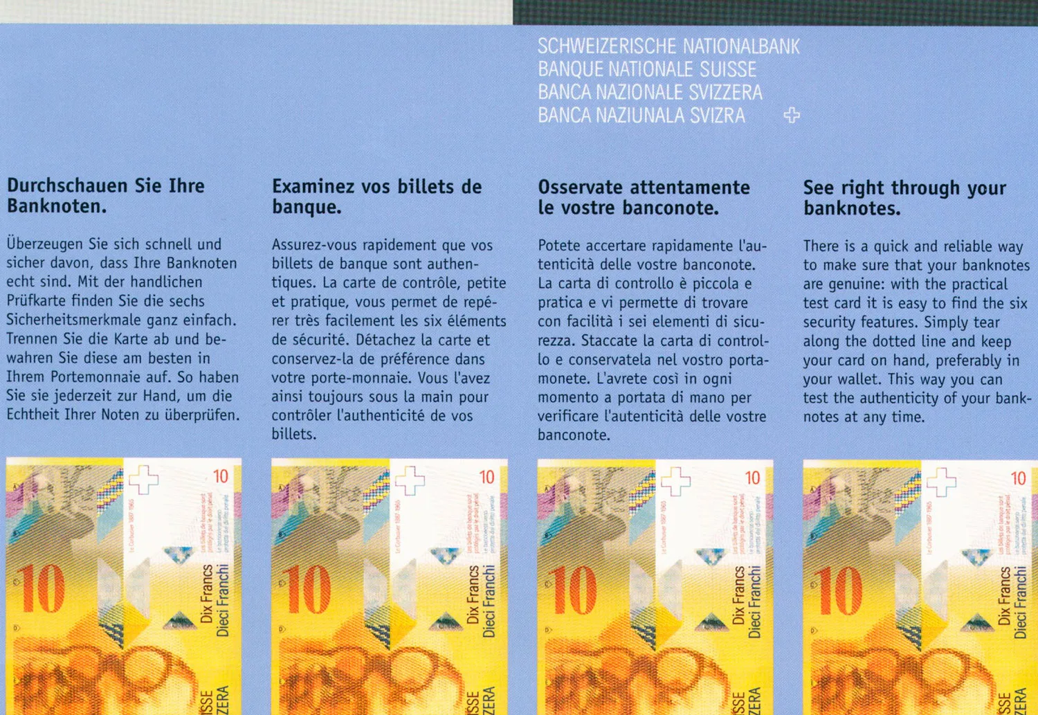
Image 01 of
04
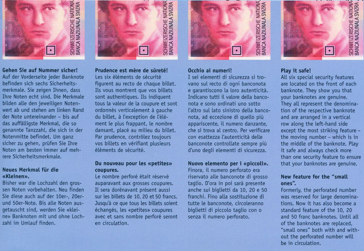
Image 01 of
04
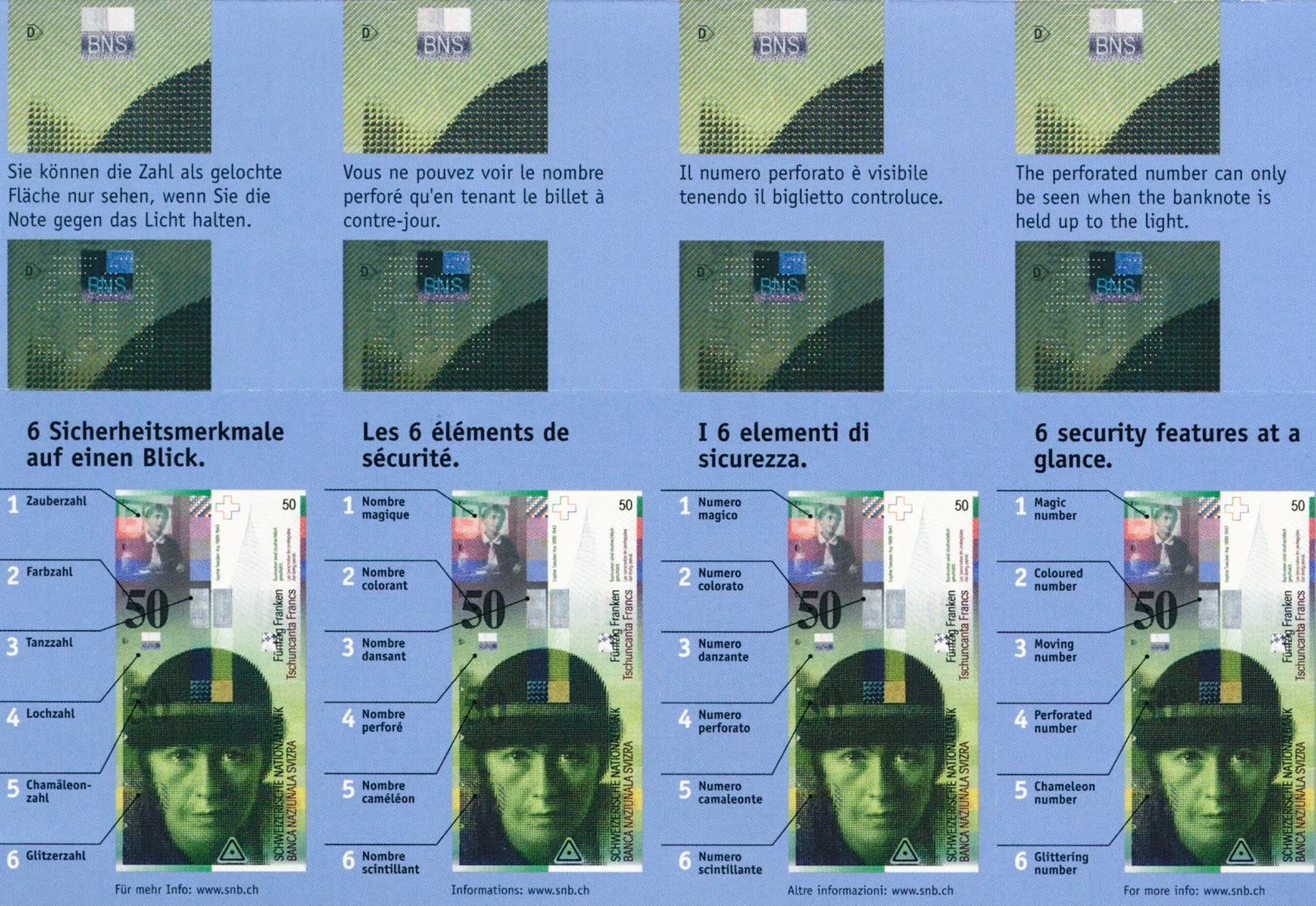
Image 01 of
04
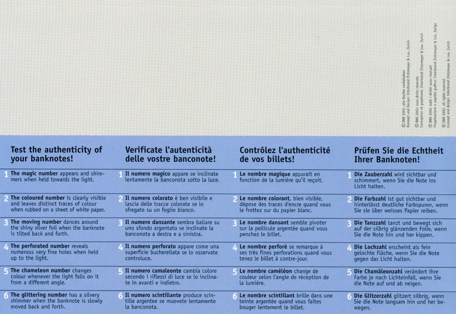
Image 01 of
04
A little piece of Switzerland
It was only when people started using them that the notes gained acceptance. So, all in all, this was a series that polarised – an almost avantgarde piece of Switzerland in people’s wallets.
Switzerland, the land of banks
Switzerland is one of the world’s leading financial centres – but how did its close association with banking evolve? The exhibition shows how deeply banking is entrenched in Switzerland’s DNA and traces the development of the banking system by displaying an impressive range of items. Jewish moneylenders, Lombardy merchants and, later, urban exchange offices laid the foundation for the modern financial centre. The exhibition goes beyond merely retracing historical developments; it also invites visitors to engage with the land of banks as it is today.