New movie posters for Zurich
The works of the Lucerne graphic designer Paul Brühwiler were virtually omnipresent on Zurich’s cultural billboards for almost 20 years, achieving cult status. Even in the office of the director of the Film Podium they were not safe from thieves.

Felix Graf
Felix Graf was a curator at the National Museum Zurich until 2017. Now he works as a freelance publicist.
When Paul Brühwiler returned from California to Switzerland in 1973, at the age of 34, he brought with him a wealth of professional experience. After receiving an education in graphic design and attending the Lucerne School of Arts and Crafts, he had moved to Paris to receive further training, before travelling to the USA where he worked for Saul Bass, Hollywood’s most renowned film title designer, then at the studios of husband and wife designers Ray and Charles Eames, before finally setting up his own agency. One of his major clients was the American music industry. Paul Brühwiler, also known as Pabrü, designed record covers for Steppenwolf, Small Faces, the Beach Boys, Kenny Rogers and Janis Joplin. Looking back on this time, Brühwiler once said: “Everything was allowed or rather demanded, everything had to be bolder and different, the music, like the words, had shock value, as did their covers.”
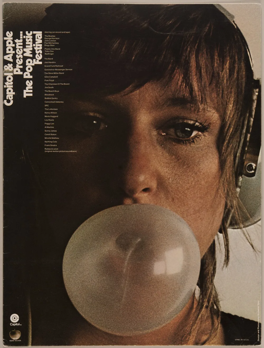
Portfolio for advertising prints from Capitol & Apple Records. With information on the pop group Small Faces. Graphics and photography: Paul Brühwiler and Rod Dyer, 1970
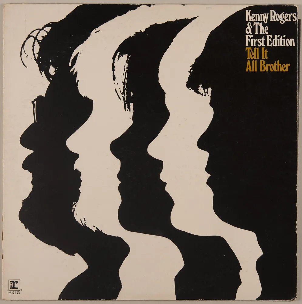
Record cover for Kenny Rogers & The First Edition. Paul Brühwiler, 1970
It is not just professional experience that Paul Brühwiler brought with him from America, but also the need to focus on his passion for free graphic poster design for non-commercial purposes. It was the perfect time for this; there was a spirit of optimism and experimentation in the air. Brühwiler found the ideal client in the presidential department of the city of Zurich with its cultural institutions. In his first meeting with Bernhard Uhlmann, the then director of the Film Podium, his collaboration with Saul Brass and the latter’s affinity with Hitchcock stood him in particularly good stead.
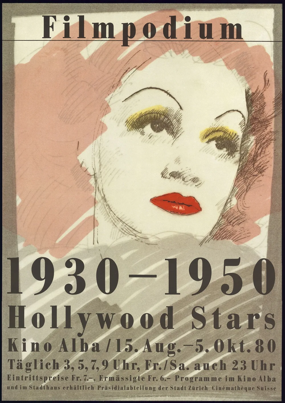
Poster for Hollywood Stars 1930–1950 of the Film Podium. Screen print. Paul Brühwiler, 1980
Small print runs, huge impact
Bernhard Uhlmann recalls: “Paul appeared in my office in the city hall one day, accompanied by an American woman, and said that he’d like to design posters for us. That was the start of an extremely easy and fruitful 20-year partnership. If we needed to change the schedule at the last minute, which was not uncommon, I would call him and ask whether he could do another poster quickly. He would have it ready the next day or two days later. Paul’s posters were rarities right from the outset. We would only arrange small print runs. About 80 for the billboards in the city and about 20 for us.”
Bernhard Uhlmann, director of the Film Podium from 1971 to 1992, then Deputy Director of the Cinémathèque Suisse in Lausanne, wanted new posters when he took office. They needed to be posters that attracted people to the cinema rather than focused on obeying the teachings of a school of arts and crafts. As early as 1975, five of Brühwiler’s cultural posters were among works decorated by a jury appointed by the Federal Department of Home Affairs (FDHA) as the “Best Swiss Posters of the Year”.
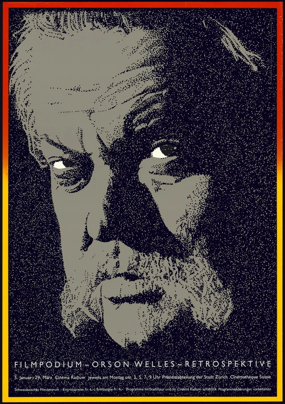
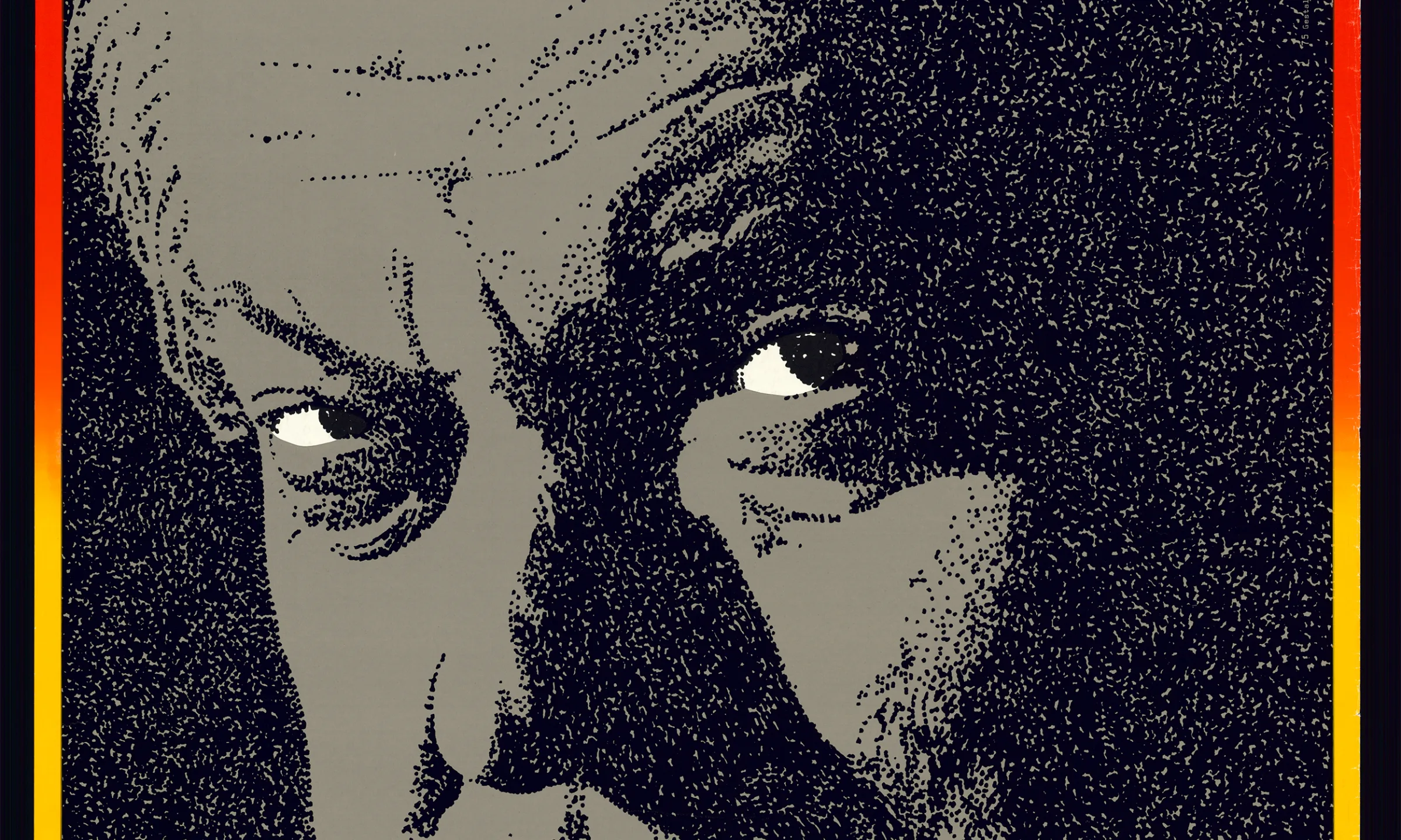
Poster for the Orson Welles retrospective by the Film Podium of the city of Zurich. Award for “Best Swiss Posters of the Year”. Paul Brühwiler, 1975
The eye-catching gaze
It is not the spoken word that makes good actors stand out primarily, but their facial expression. Especially their gaze. It is this gaze of the actor or director that Paul Brühwiler deliberately focuses on as the eye-catcher. He really hits the mark with this on the posters for the Orson Welles and Fritz Lang retrospectives. The same applies to the empty gaze from dead eyes of the vampire Nosferatu, illuminated by neon lighting. The sight of this monster floating out of the darkness towards the viewer sends shivers up and down the spine.
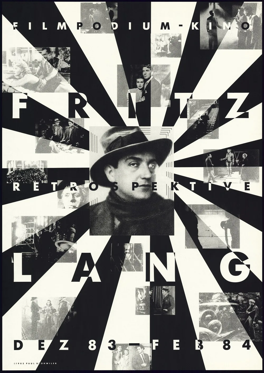
Poster for the Film Podium’s Fritz Lang retrospective. Paul Brühwiler, 1983
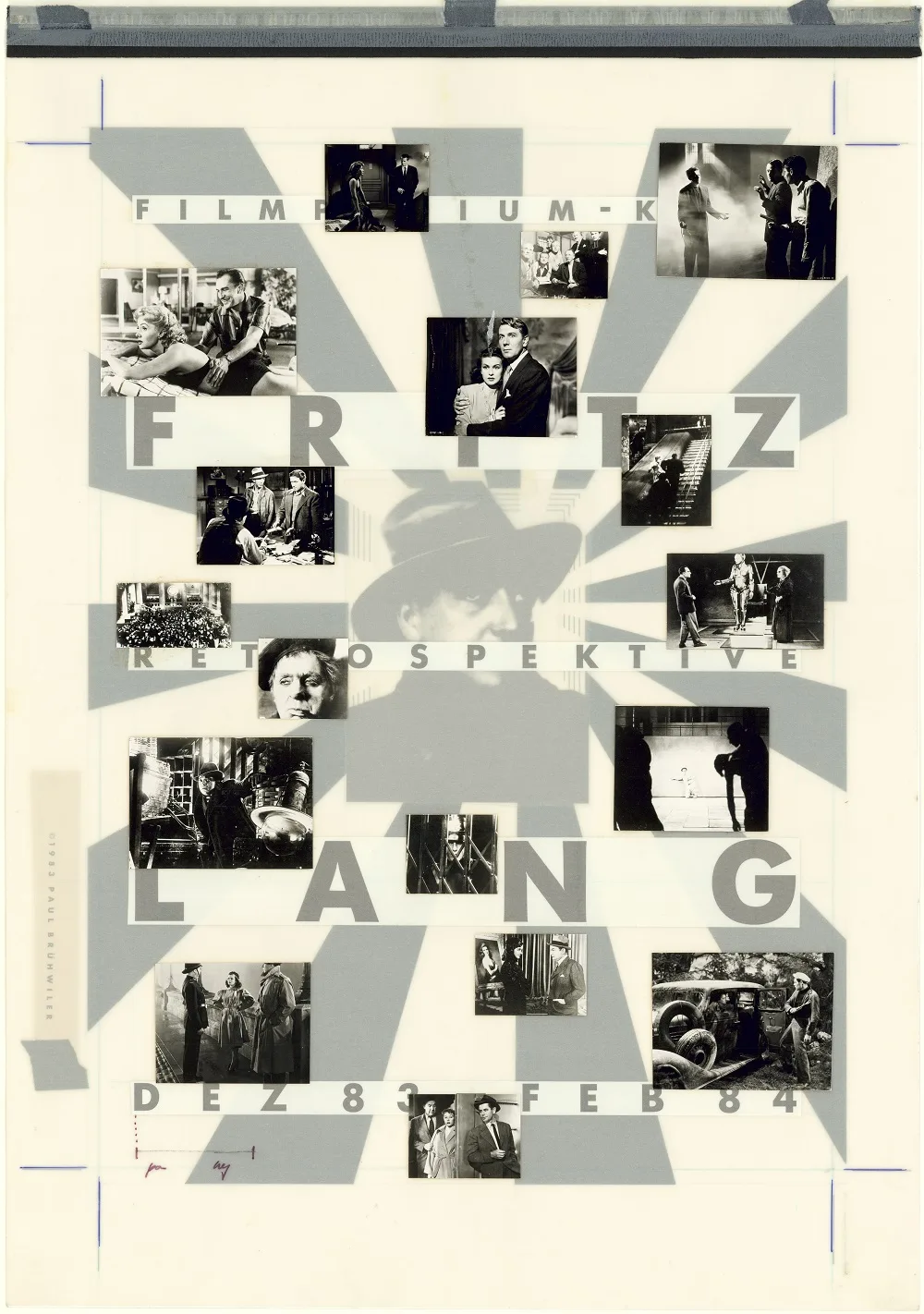
Print template for the poster for the Fritz Lang retrospective with tracing paper and photos. Paul Brühwiler, 1983
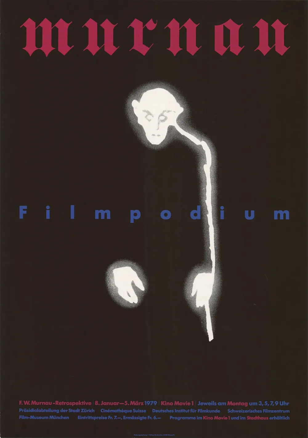
Poster for the Film Podium’s F. W. Murnau retrospective. Paul Brühwiler, 1979
Classics and rarities
Pabrü’s posters attained cult status among film lovers. More from Bernhard Uhlmann: “We received high offers. My favourite poster, the one for the Orson Welles retrospective, was even stolen from my office on the second floor of the city hall. Even though the thief had to walk through an outer office first. Back then the offices were kept unlocked. If I’m not mistaken, the then mayor, Sigi Widmer, wanted them like that. Not long after that, we started locking the offices.”
A woodcut as template
A particularly fine example of Paul Brühwiler’s free artistry is the poetic movie poster for the Gérard Philipe retrospective (1994). The template for the screen print of Bea Spillmann is a woodcut. The original draft as well as numerous sketches of ideas and drafts, both in the museum’s collection and in the current exhibition, document the journey from the idea to preliminary studies and print template through to the finished poster.
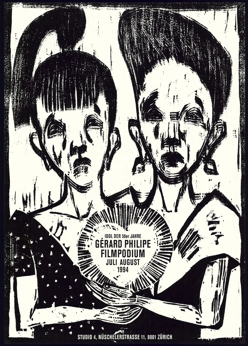
Poster for the Film Podium’s Gérard Philipe retrospective. Screen print. Paul Brühwiler, 1994
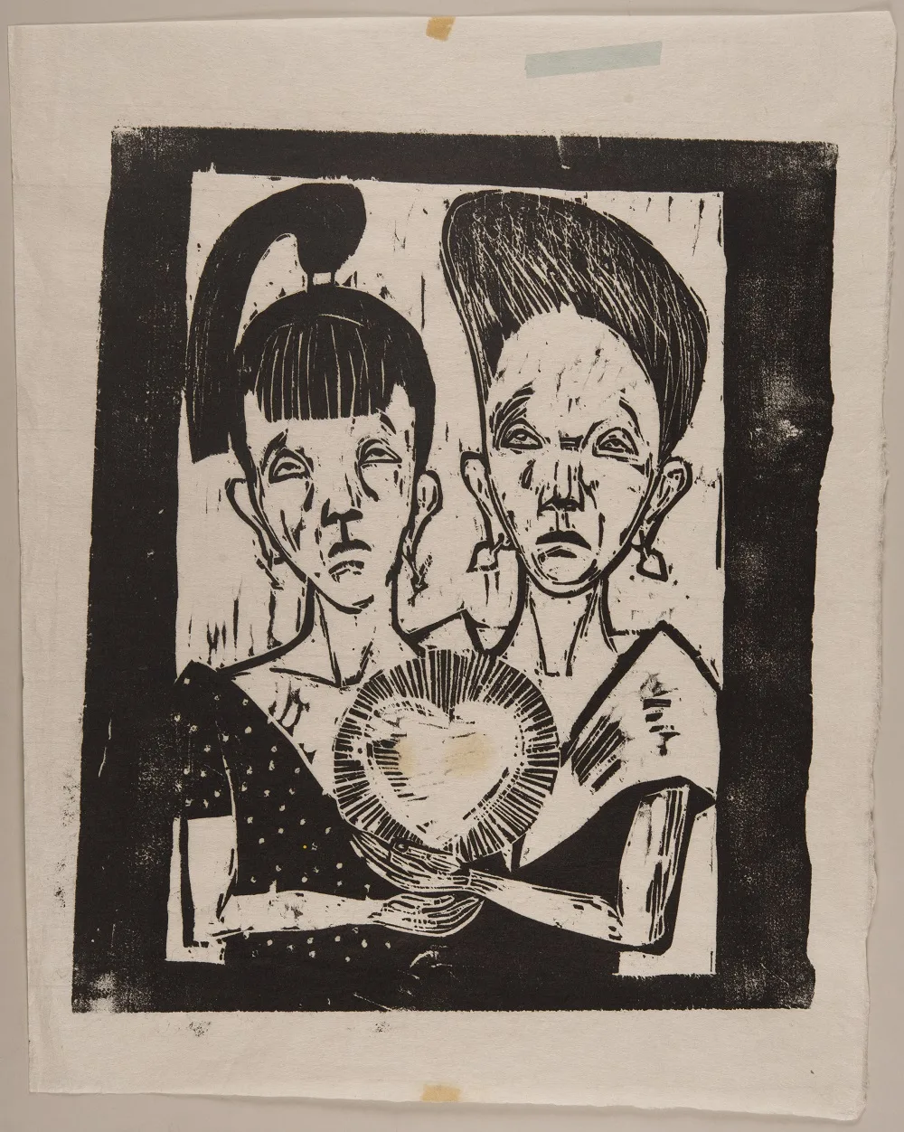
Original draft for the poster for the Gérard Philipe retrospective. Woodcut. Paul Brühwiler, 1994
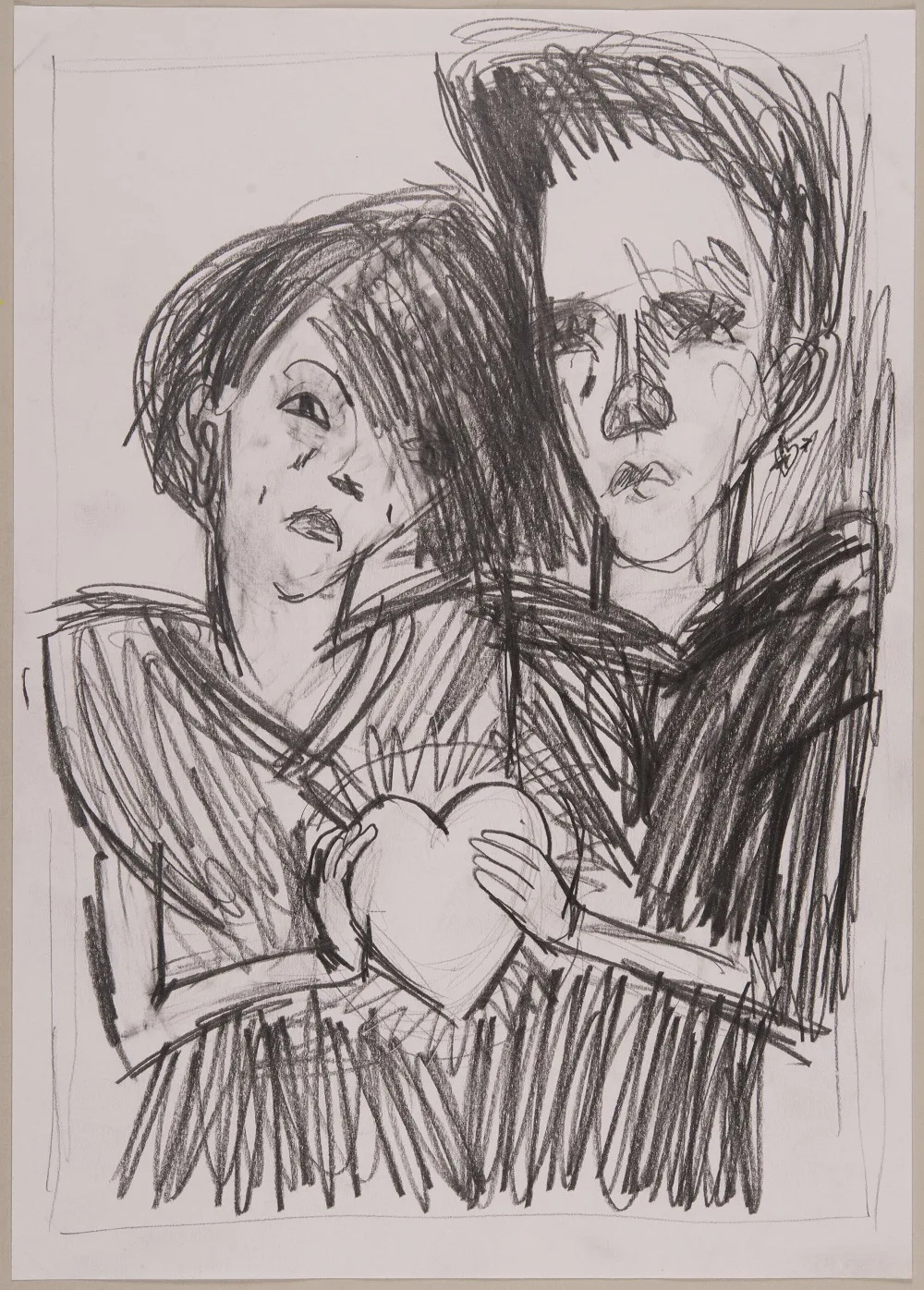
Draft sketch for the poster for the Gérard Philipe retrospective. Pencil on paper. Paul Brühwiler, 1994
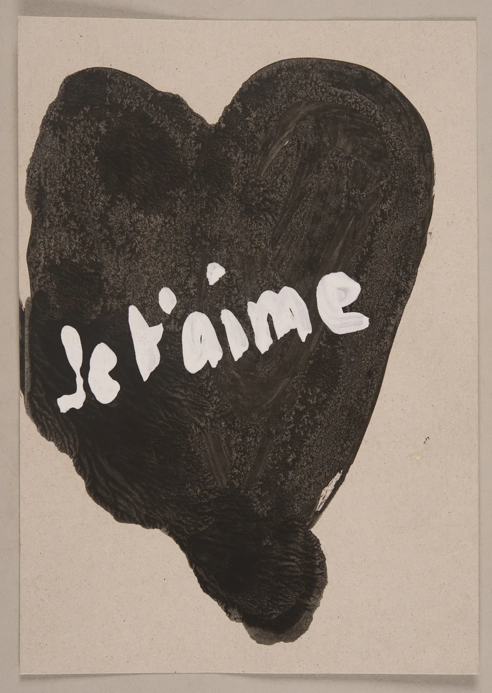
Draft sketch for the poster for the Gérard Philipe retrospective. Gouache on paper. Paul Brühwiler, 1994
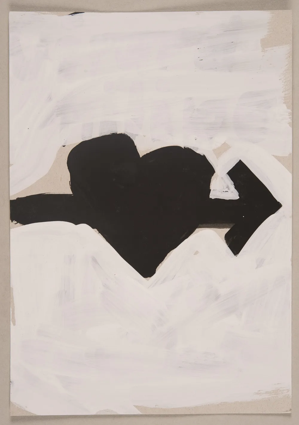
Draft sketch for the poster for the Gérard Philipe retrospective. Gouache on paper. Paul Brühwiler, 1994
The graphic designer as a clown and puppet
The human face holds a particular fascination for Paul Brühwiler not just as a graphic designer and videographer, but also as a painter. In 1984, he designed the cover of the internationally renowned trade magazine Graphis, published by Walter Herdeg in Zurich, with an impressive self-portrait. The artist took a critical look at his profession and himself: dollar signs shine from the eyes, the graphic designer’s hand is suspended from wires like the limbs of a puppet, and the clown’s smile brings no joy. The awkwardly drawn magazine title also expresses ambivalence: free artist and commercial graphic designer, art and commerce – this is not as simple as that.
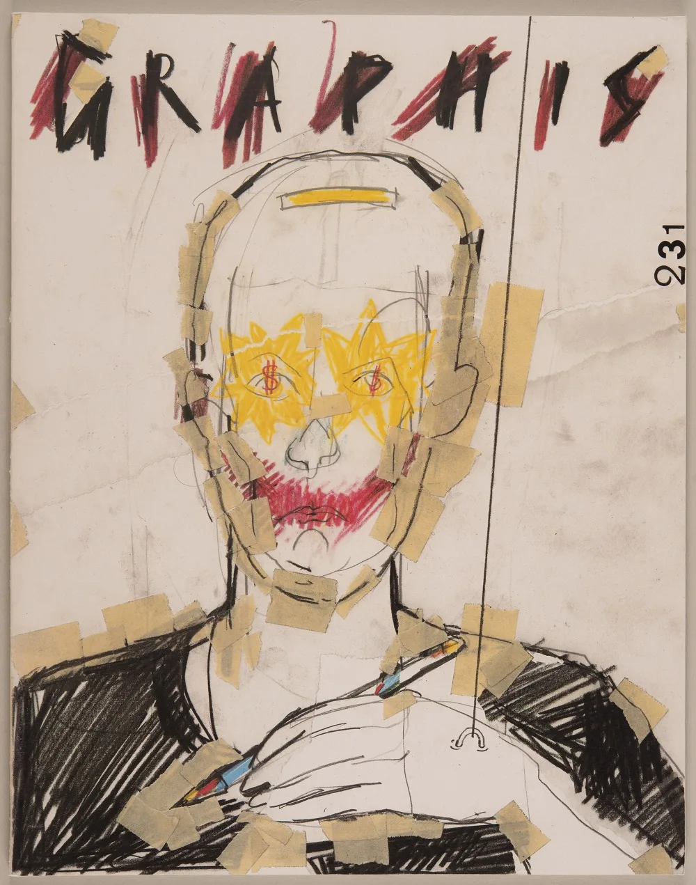
Cover of Graphis magazine, No. 231, Paul Brühwiler, 1984
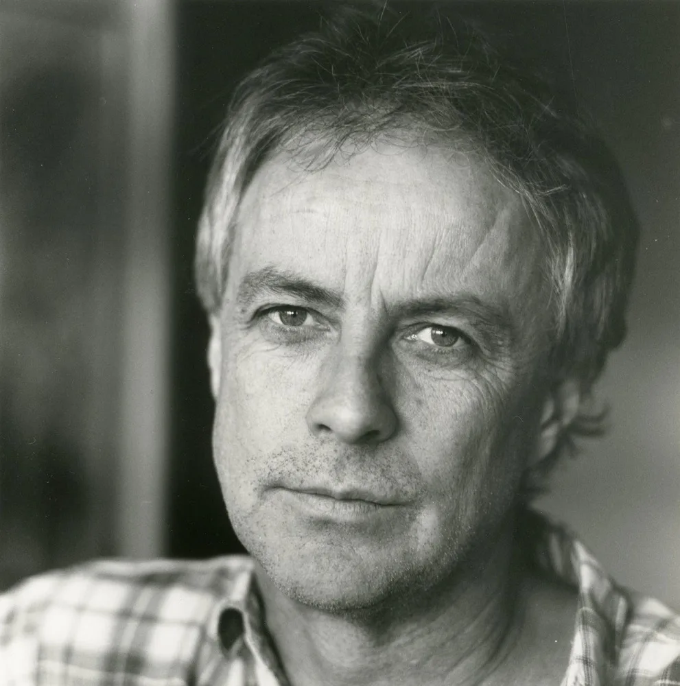
Paul Brühwiler around 1993. Privately owned. Photo: Priska Ketterer