On the road with Rosmarie Tissi
Rosmarie Tissi (*1937) has been a graphic designer for almost 60 years. She is currently working on her new book, which will be out in spring 2018. Curator Daniela Schwab interviewed Rosmarie Tissi about her work, experiences and views.
Some of your works are currently on show in the exhibition “10 x Swiss Graphic Design. From draft to print”. I personally love the draft and poster for the “World City Expo Tokyo 1996”. How did this idea come about?
Rosmarie Tissi: It was a poster campaign. The Japanese, Europeans and Americans took turns in designing a poster to draw attention to the proposed model city on an artificial island in Tokyo Bay. I found it difficult at first to develop a poster idea for a city that didn’t exist yet. One evening, I was standing by the window in our Schipfe studio [in Zurich] looking out at the lights reflected in the Limmat River. The block of black Japanese text was ready, and I pictured this as the outline of the imaginary city with its lights reflecting in the sea.
Are there also stories behind the origin of other objects in the exhibition?
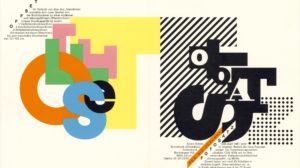
In the poster for the Ginza Graphik Gallery exhibition in Tokyo in 1997, an O and T in Japanese script accompany O and T from the Latin alphabet. I wanted to bring some colour into it, so I added a red square for Sigi Odermatt and a green dot for me. Although Sigi felt that green would have suited him better.
You’ve done a lot of travelling, and on your own, at a time when many countries were a lot less open to tourists than they are today. You’ve visited around 70 countries. I imagine you’ve had a lot of adventures, right?
I do have a lot of memories. For example, I had been flown to Kakadu National Park in Australia in a little plane with three other tourists. We were supposed to be picked up again after seeing the cave paintings, but we were told that the plane had crashed. Although nobody had died, news like that still filled everyone with fear. But I also recall some amazing natural spectacles, such as the sunsets in Tikal when hundreds of green parrots flew up out of the jungle at the same time as if reacting to some unknown start signal. Or one occasion on the banks of the Kinabatangan River in Borneo when a group of forest elephants suddenly appeared with a youngster. Or swimming with stingrays off the Cayman Islands.
You have travelled to Canada, the USA and China for workshops at universities and to Japan, Mexico, Finland, Bulgaria and Iran to judge competitions. Are there conversations that you can still recall?
A student once asked me after a lecture whether I ever compromise and make changes to my work if a customer asks me. I said yes. Whenever a customer wanted something different, I would try it out and then there would be two possibilities. Either the customer saw that his idea wasn’t any good or he would be right and it was actually better that way. So, then you have to be able to admit that. And the customer is particularly happy in those instances.
And sometimes you can persuade the customer, as was the case with Mettler, a textile company for which I developed a logo. I was dealing with the son, but the father was a passionate horse rider and wanted a horse as the company logo. I felt right from the outset that a horse was not a good fit for the textile company and therefore created an alternative logo as well: a cross-hatched M, which gives the impression of woven fabric. I showed the horse logo to the customer first. When I then produced the other logo, he was absolutely thrilled. And he then managed to persuade his father.
Have you ever turned down any jobs?
No. But I have also made a point of looking for work that promised to be interesting. For example, we, our design consultancy Odermatt & Tissi, wrote to the educational publisher Lehrmittelverlag to say that we were interested in designing textbooks. That’s how I got the job for the chemistry textbook. That was a huge job at the time, particularly with having to find suitable photographs for the various themes, e.g. the picture of a sulphuric acid plant and the photos of artificial heart valves. I visited countless factory archives to look for images. And I had to immerse myself fully in a new subject. But it was also tremendously exciting.
If you could add other works of yours to the current exhibition, which ones would you choose?
Probably the 95 and 96 Serenades. These are two of my favourite posters. For the Serenades I often designed several posters on a particular theme. For the 92 and 93 Serenades, the theme was “evening ambience”; for the 95 and 96 Serenades it was “Music”. I enjoyed the Serenades orders. I would finish one poster and would already have ideas forming for the next one and would start to play around with them. I also liked the music, I really enjoyed going to the concerts.
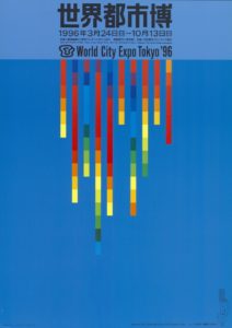
Poster. World City Expo Tokyo 1996. Rosmarie Tissi. 1994
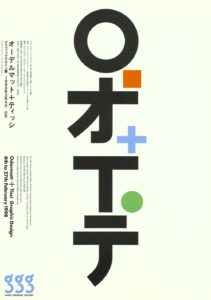
Poster. Odermatt + Tissi Graphic Design 4th to 27th February 1997. Rosmarie Tissi. 1997
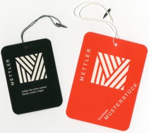
Draft for a logo for the Mettler Co., Rosmarie Tissi. 1969
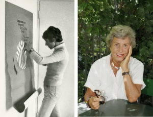
On the left: In the studio on Lindenhofstrasse in Zurich, around 1972. Photo: Siegfried Odermatt
On the right: Rosmarie Tissi around 2011. Photo: Niklaus Stauss
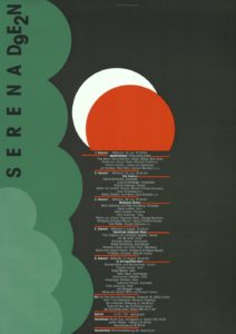
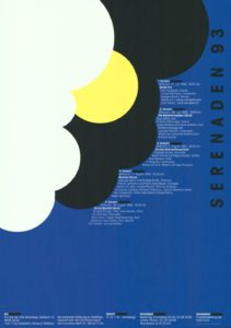
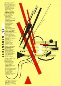
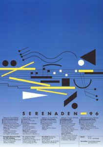
Posters. Serenades 92, 93, 95 and 96. Rosmarie Tissi. 1992-96

