Award-winning Posters
Between 1941 and 2001 a jury commissioned by the Swiss Federal Department of Home Affairs (FDHA) selected the best advertising posters each year. A look at some of the best posters held by the Swiss National Museum.
Relaxing with a book
In 1954 Celestino Piatti’s first book poster was one of the twenty-eight award-winning works.
Of the reader you merely see his nose, an eye, a smoking pipe and a hand holding an open book. He’s reading, lounged in a deckchair, outside. The blue sky shines through the outlined nose and hand. The book is shown as a bright, white space, the deckchair indicated as a set of three red and white stripes.
“Relaxing with a book”, it says at the bottom, with the word “Book” in big letters. You can’t get it any clearer.
Relying on simple graphic means and a fine sense of humour, the artist put his message in a nutshell.
Could the Swiss Publishers and Booksellers Association advertise books with the picture of a pipe-smoking reader in a deckchair today? Probably not. In 1954 this was still an option.
Book advertising was a recurrent theme throughout Celestino Piatti’s poster career. Piatti is among the group of Swiss artists with the most award-winning posters, along with peers like Donald Brun, Herbert Leupin, Josef Müller-Brockman and Ruedi Külling. Withal, his work for the Deutsche Taschenbuch Verlag (dtv) made him one of the most celebrated graphic artists in Europe.
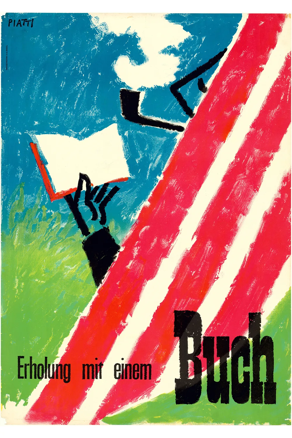
Celestino Piatti. Commercial poster for the Swiss Publishers and Booksellers Association. Colour litho. Basel: Wassermann, 1954.
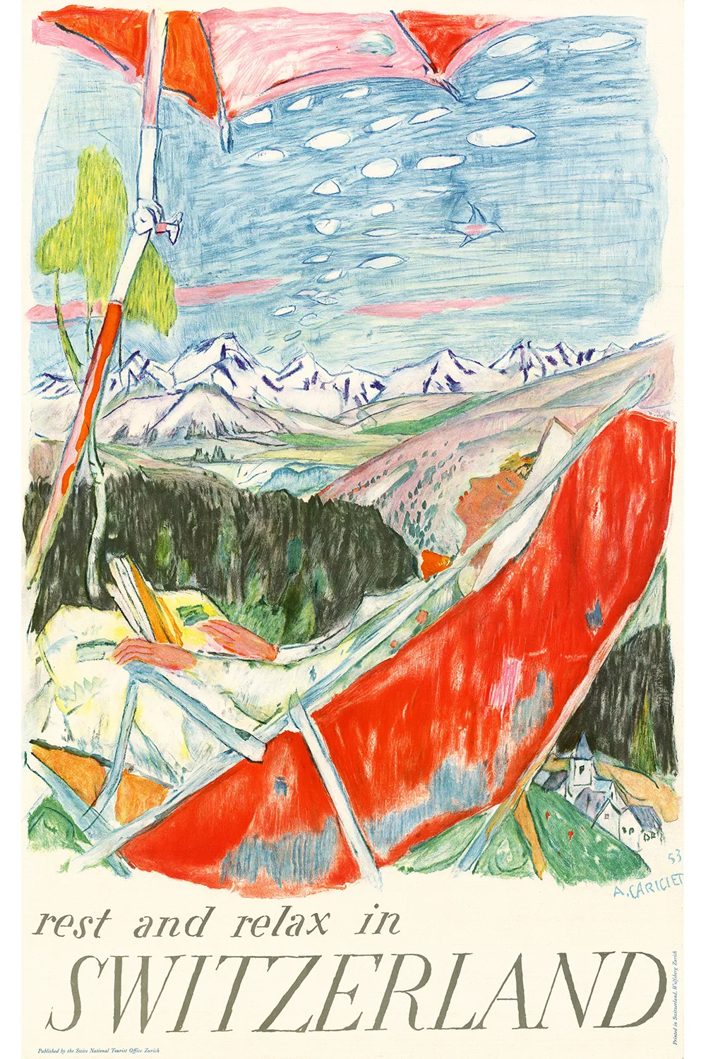
Alois Carigiet. Tourism poster for the Swiss Tourist Board. Colour litho. Zurich: Wolfensberger, 1953.
Piatti’s reader in a deckchair is making reference to an award-winning poster created by Alois Carigiet the year before which showed a woman in a red deckchair against an airy blue mountain sky. It was created to promote Switzerland as a holiday destination: “rest and relax in Switzerland” – “für geruhsame Ferien in der Schweiz” – “repos et détente en Suisse” – “vacance riposanti in Svizzera”. Carigiet, in turn, was referencing Henri de Toulouse-Lautrec’s famous Passagère.
According to the 1953 annual report of the Swiss Tourist Board, Carigiet’s colourful tourism poster was printed in five languages (G, F, I, E, and Span.) with a total print run of 15,000 copies in the so-called English format (64x102) for posting in the Tourist Board’s branches abroad. In addition, they printed 20,000 copies in the shape of small pop-up posters.
Alois Carigiet and the PKZ rooster
Alois Carigiet, who today is remembered above all as the author of children’s books such as Schellen-Ursli and Flurina, was also one of Switzerland’s great graphic artists. Between 1928 and 1959, Carigiet, who had originally trained as a decorative painter, designed more than a hundred posters. His style stood out for its humour, ingenuity and pointed messages. His hallmarks were humanized animal figures, among which the strutting PKZ rooster wearing a light-blue suit coat, gloves and a walking stick stands out eminently (1935). Just imagine, in the 1930s, what an impact these colourful and bold images towering on advertising columns had on viewers in the streets, notably, at a time when people were not yet accustomed to colour photography or TV commercials, let alone to online advertising. In those days a Sunday excursion to the new posters on show at the Zurich Bellevue and Central was a popular family pastime.
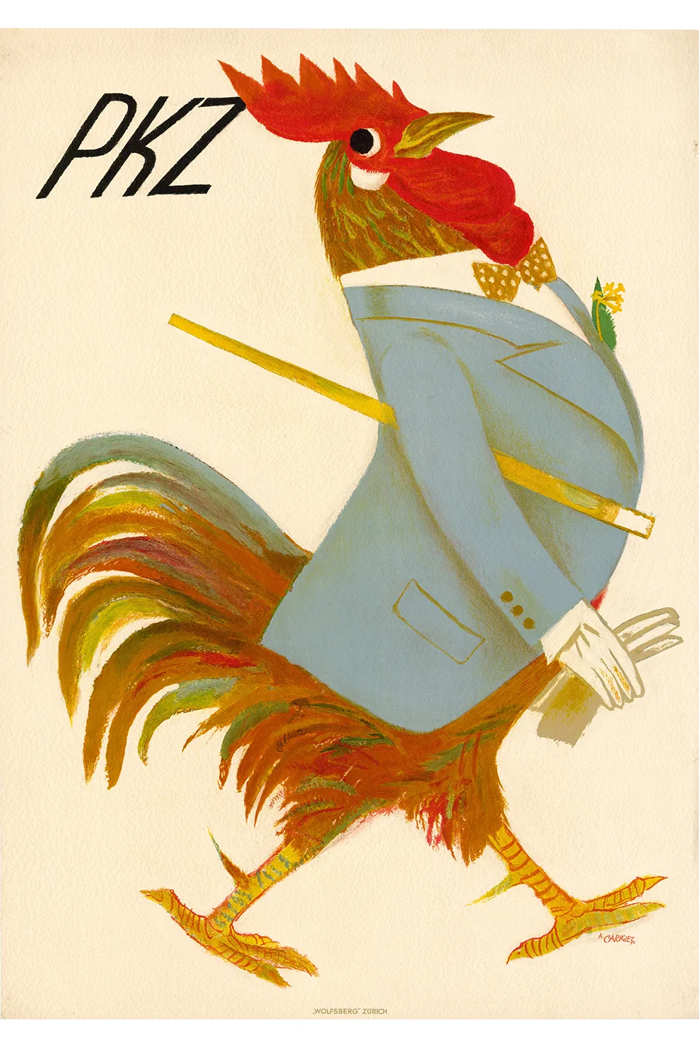
Alois Carigiet. Commercial poster for PKZ. Colour litho. Zurich: Wolfensberger, 1935.
OLMA and ball pens
Let’s remain with the rooster for a moment, not in the metaphorical sense of the term but as an advertising figure. Ruedi Külling chose the famous rooster from the fairytale The Town Musicians of Bremen for his award-winning poster for the agricultural show OLMA in 1990.
Külling had begun experimenting with the crowing cock for an OLMA poster as early as 1965. The Graphics Collection of the Swiss National Museum holds numerous sketches and pre-designs of the rooster created by this brilliant illustrator. Almost enough to populate an entire poultry farm. However, he never submitted any of his designs.
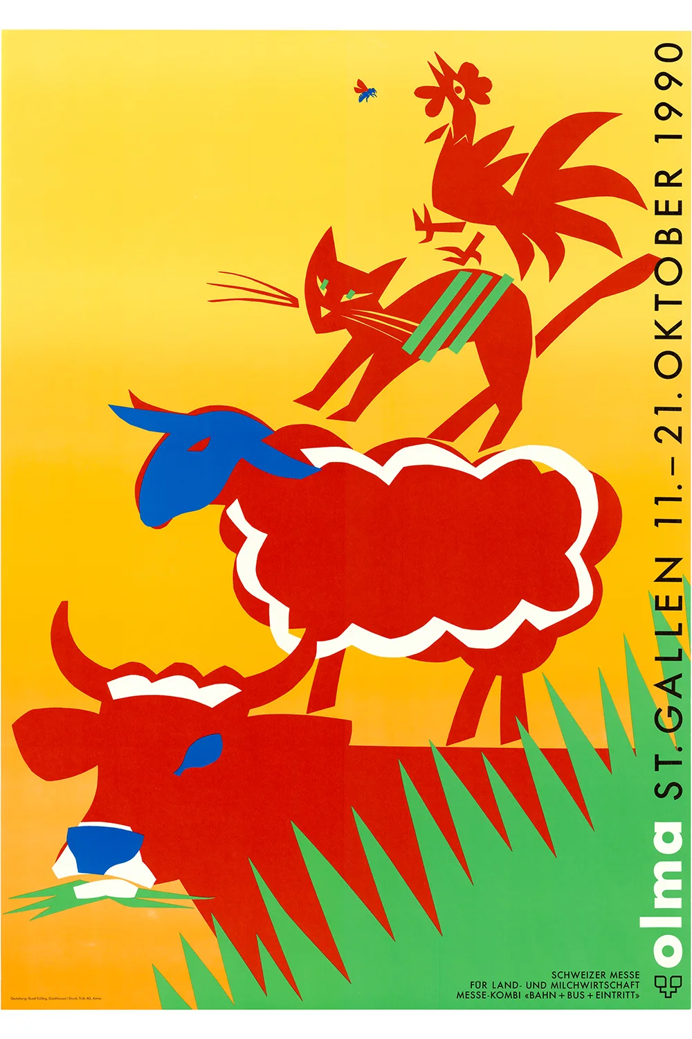
Ruedi Külling. Event poster for OLMA. Screen print. Degersheim: Piller Siebdruck AG, 1990.
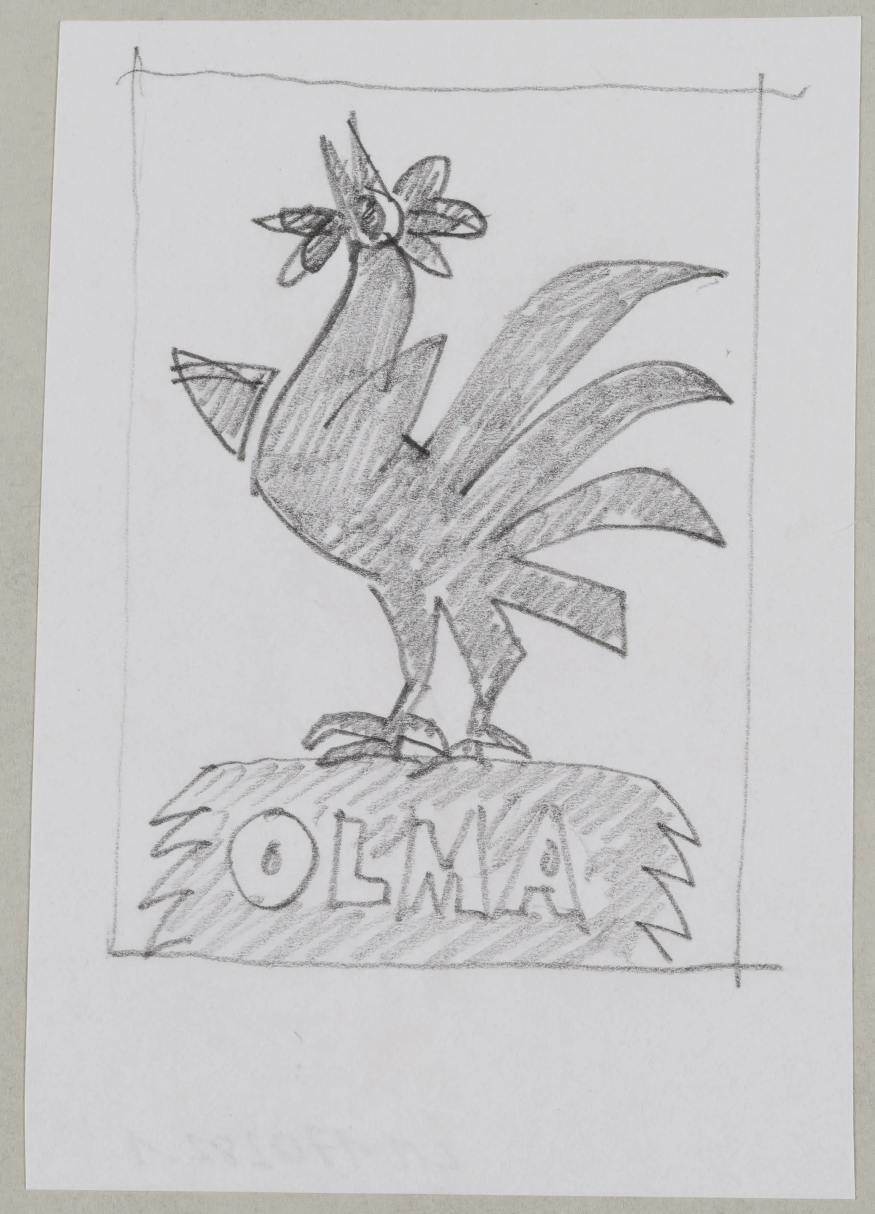
Ruedi Külling. Sketch for OLMA poster. Pencil on paper. 1965.
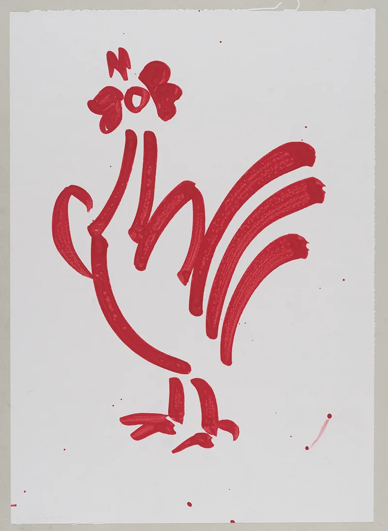
Ruedi Külling. Sketch for OLMA poster. Gouache on paper. 1965.
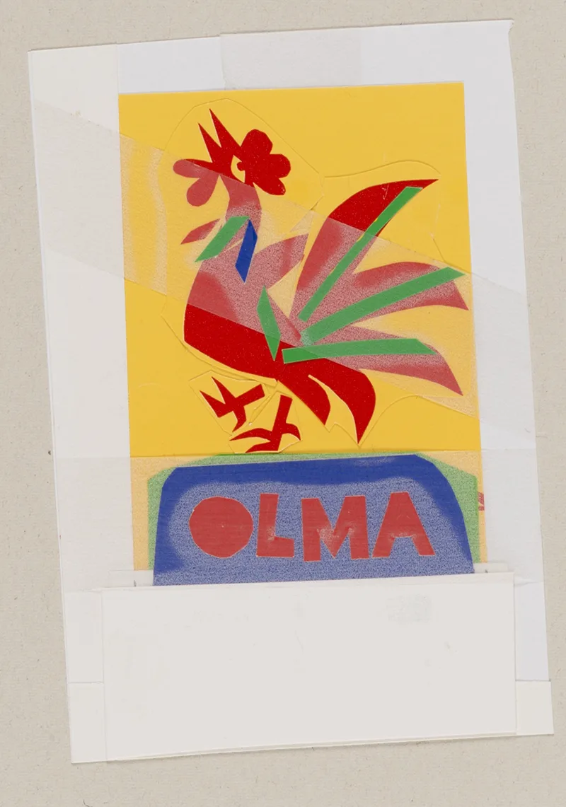
Ruedi Külling. Sketch for OLMA poster. Collage. 1965.
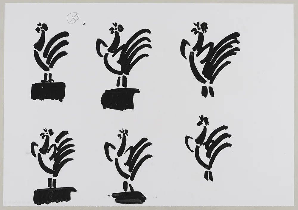
Ruedi Külling. Sketch for OLMA poster. Gouache on paper. 1965.
Ruedi Külling made headlines in 1961 with his poster for the new, low-cost ball pen produced by the company Bic. The ingenuity of the design lay in promoting the product with its own output, in this case scribbling the name of the product with a Bic ball pen on a piece of paper: quickly, efficiently and without producing blobs of ink which normally happens when using a conventional fountain pen. The secret of the design lay in its “reduction to the max”.
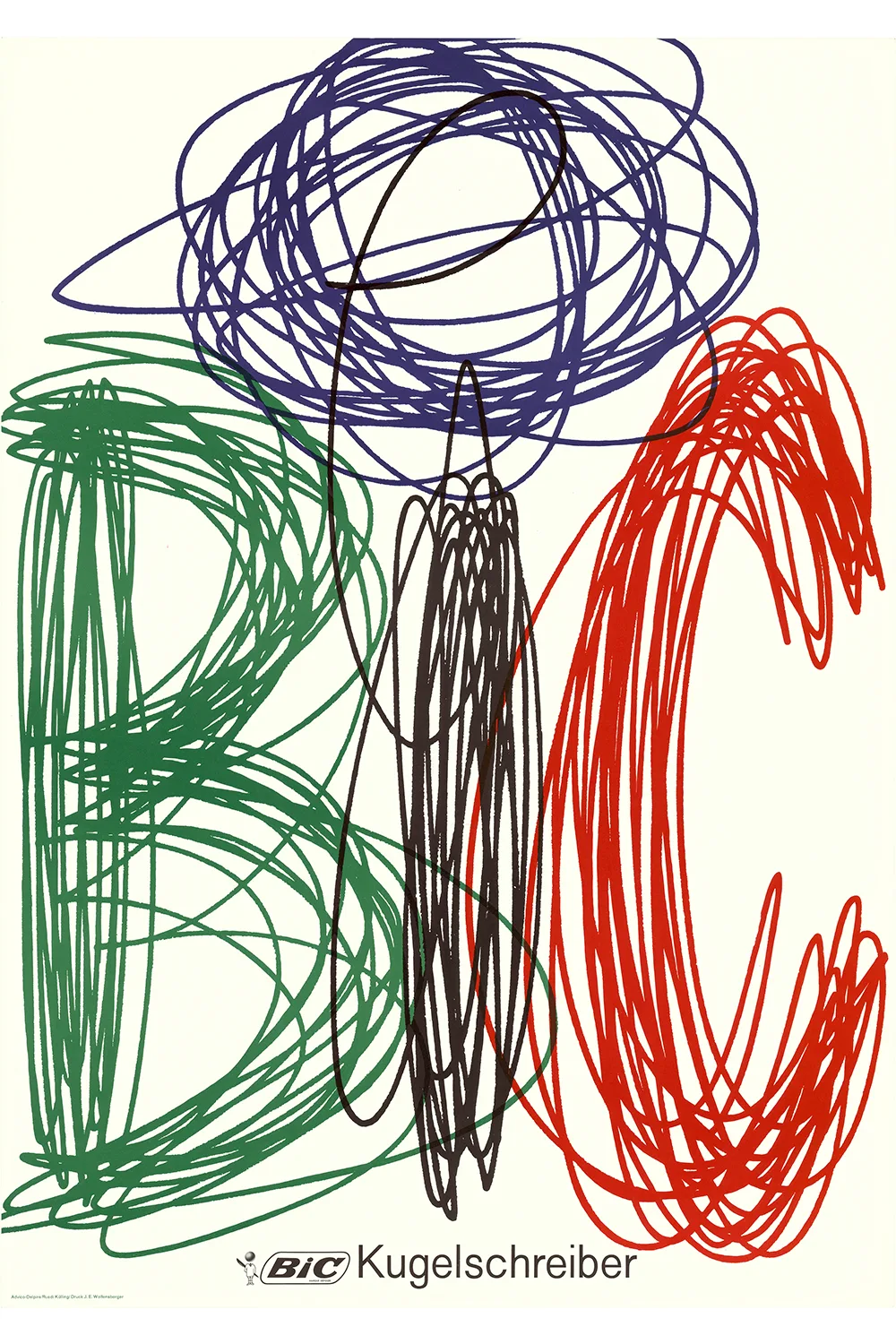
Ruedi Külling. Commercial poster for Bic. Offset print. Zurich: Wolfensberger, 1967.
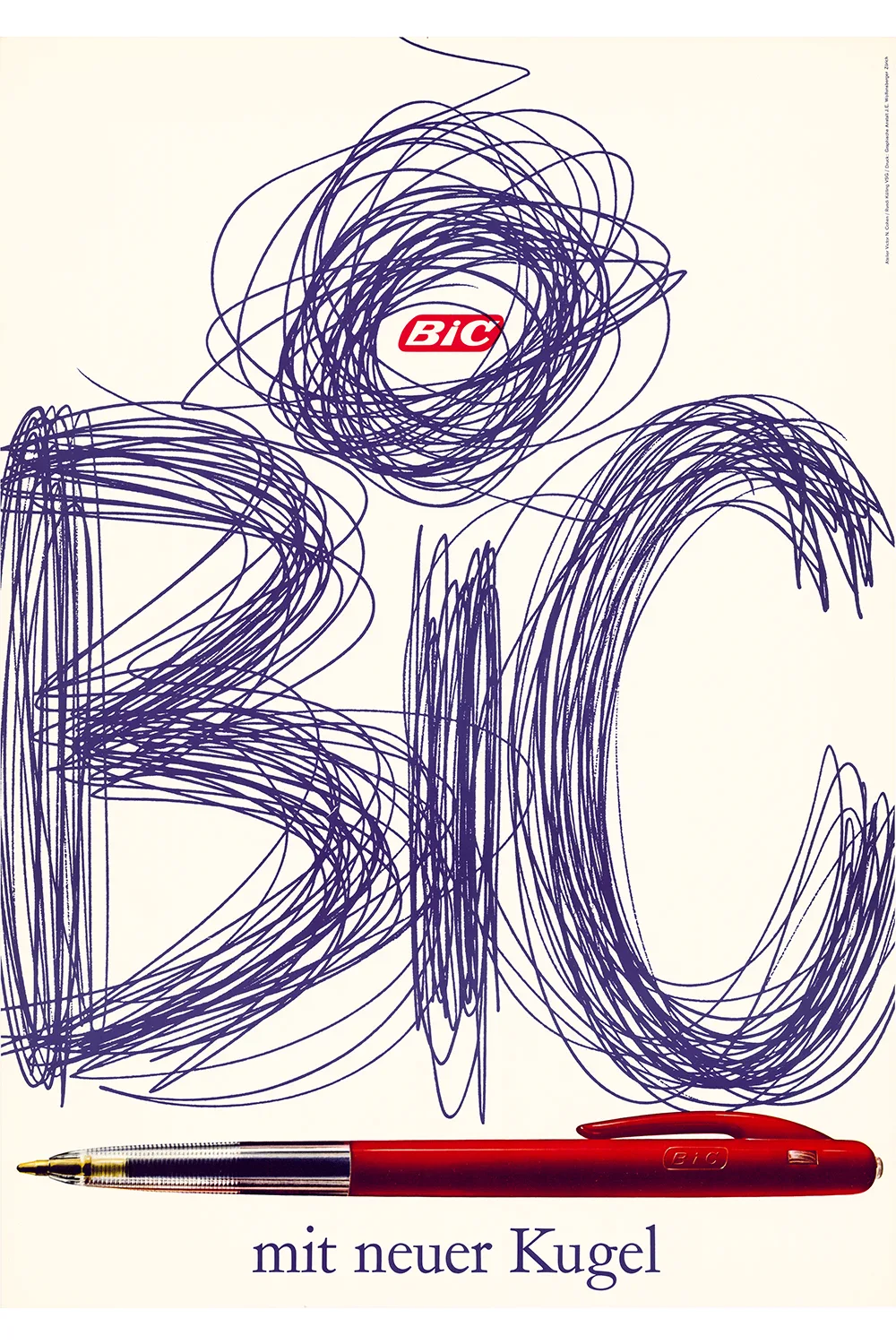
Ruedi Külling. Commercial poster for Bic. Offset print. Zurich: Wolfensberger, 1961.
Icons of Swiss poster art
Külling had nearly all of his posters printed by Graphische Anstalt J. E. Wolfensberger in Zurich, using modern offset printing presses, which were put into operation in 1956. Ruedi Wolfensberger, then head of the company, had learnt his profession on an old lithographic fast press from 1905.
The history of Swiss poster art is closely associated with the name Wolfensberger. The company founder, Johann Edwin Wolfensberger, was one of its most important promoters, working together with the pioneers of Swiss poster art from the start: Burkhard Mangold from Basel, Otto Baumberger from Zurich, and Emil Cardinaux from Bern.
The tourism posters by Emil Cardinaux for the Palace Hotel in St Moritz (1920) and by Cuno Amiet for the Station Buffet in Basel (1921), both printed by Wolfensberger on a lithographic fast press of 1905, rank among the icons of Swiss poster art. The tradition once used to enjoy worldwide acclaim and is well represented in the collections of the Museum of Modern Art in New York.
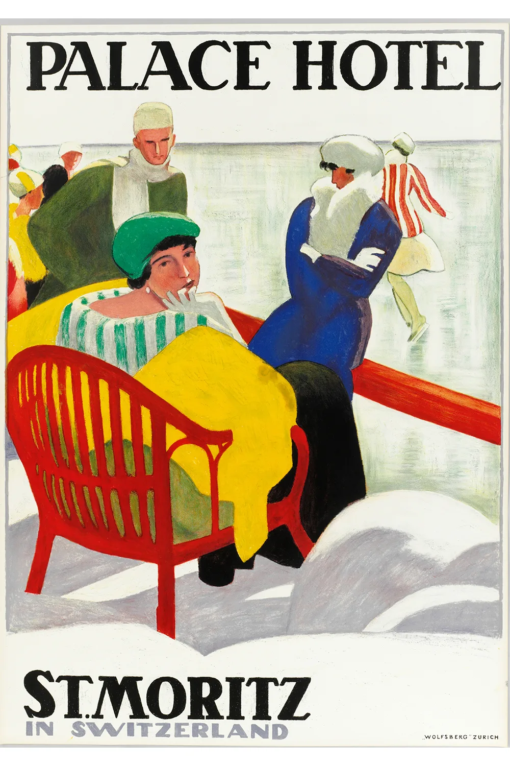
Emil Cardinaux. Tourism poster for the Palace Hotel in St Moritz. Colour litho. Zurich: Wolfensberger, 1920.
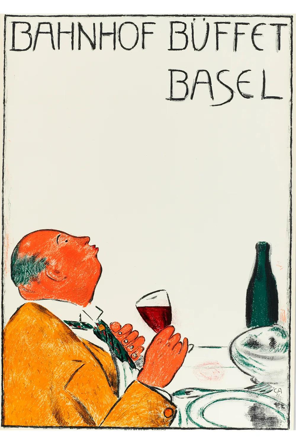
Cuno Amiet. Tourism poster for the Basel Station Buffet. Colour litho. Zurich: Wolfensberger, 1921.
The friendly mountain gnome
Probably Switzerland’s most famous advertising figure is Knorrli. When creating the design, the graphic artist and painter Hans Tomamichel had a friendly mountain gnome from his home village Bosco Gurin in the Ticino in mind. The first sketches were realized in 1947. In the 1950s the posters were printed by Wolfensberger, again using the old lithographic fast press. The works never made it to Poster of the Year, but they certainly won the hearts of the people.
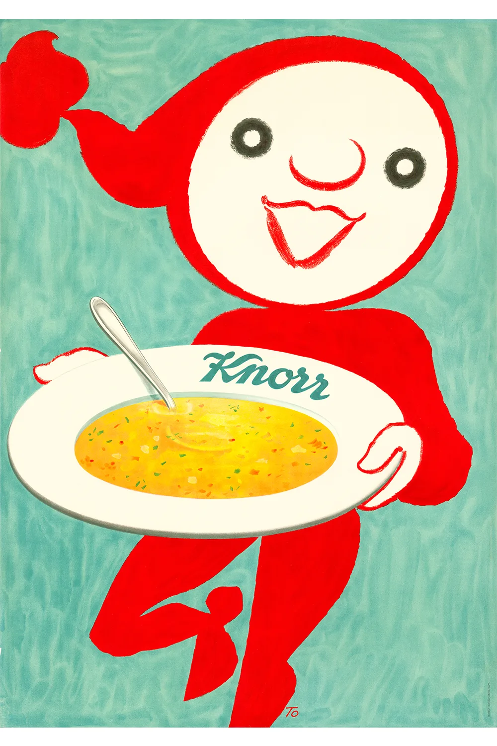
Hans Tomamichel. Commercial poster for Knorr Foods Co. Thayngen. Colour litho. Zurich: Wolfensberger, 1959.
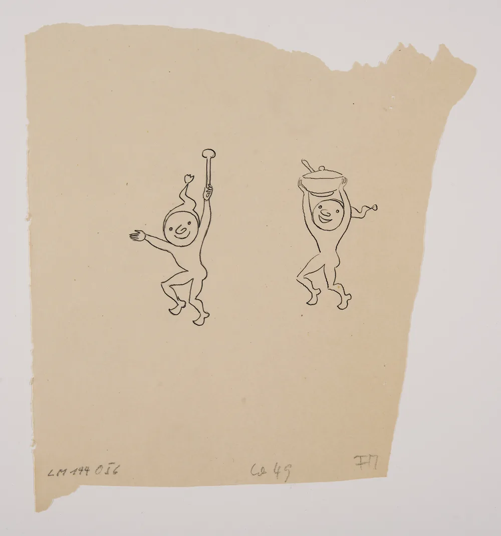
Hans Tomamichel. Sketches of the figure Knorrli. Ink drawing on tracing paper. October 1949.


